Exhibit 1
|
|
Design Thoughts:
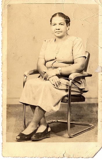
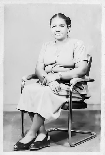
This is a picture of my husband's grandmother. I wanted to remove the cracks and creases as well as fix the color. Photoshop is a great way to bring the past back to life.
Photoshop Skills:
This is a picture of my husband's grandmother. I wanted to remove the cracks and creases as well as fix the color. Photoshop is a great way to bring the past back to life.
Photoshop Skills:
- Clone Stamp and Healing brushes - used to remove the creases and tears
- Camera Raw - white balance tool to correct the coloring, luminance adjustments to soften the grain of the photo
- Adjustment Layers - black and white to correct a blue hue, brightness/contrast and levels to bring out some more details.
Exhibit 2

|


|
Design Thoughts:
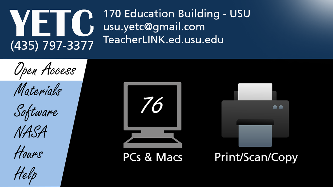
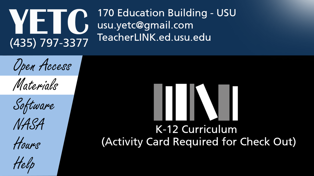
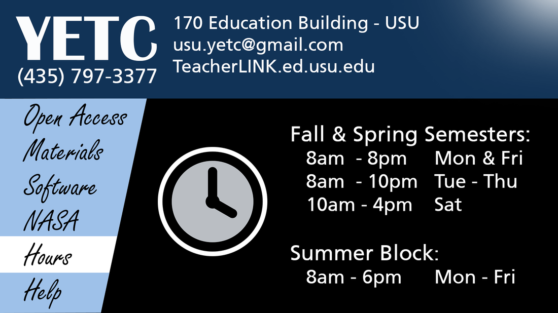
These are six designs I created to rotate on a digital screen. The purpose was to show different attributes of the YETC Computer Lab. The phone number and location will always stay at the top of the screen for easy reference.
Photoshop Skills:
These are six designs I created to rotate on a digital screen. The purpose was to show different attributes of the YETC Computer Lab. The phone number and location will always stay at the top of the screen for easy reference.
- Contrast - White contrasts well against the Aggie blue and black.
- Alignment - All of the words on the left align up to create an easy flow for the eye.
- Lines - The diagonal line of the menu guides the eye down the list so that the viewer can quickly see the topics that will be shows as the display rotates.
Photoshop Skills:
- Masking - Used to highlight which part of the menu is being displayed
- Brush tool to create effect in the top right hand corner of the displays
- Layers and Grouping to have all screens in one Photoshop file
Exhibit 3
|
BEFORE:
|
AFTER:
|
Design Thoughts:
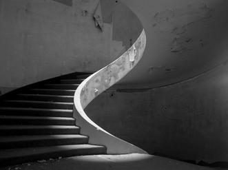
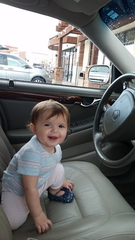
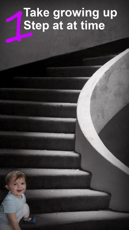
I typically work with landscapes so i decided to work with an aspect ratio that I'm not used to and set up a portrait. I found a picture of my daughter that i could use for a selection and a picture for the stairs.
- Contrast - The colors contrast well with the black and white.
- Continuity/Alignment - The natural lines of the picture draw the eye up just as we grow up.
- Healing Brush/Clone Stamp - to fix some of the imperfections on the stairs. I also extended the top edge to have the stairs keep spiraling up
- Color Balance to bring just a little tint to the stairs.
- Displacement filter to add some edges to the text
- https://commons.wikimedia.org/wiki/File:Stairs_in_the_Monte_Palace_hotel,_azores_sao_miguel.jpg
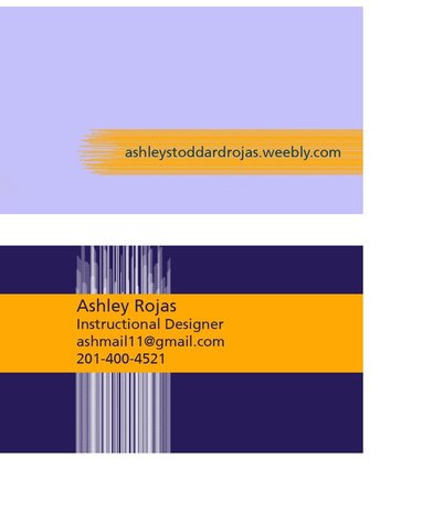
Exhibit 4 - Business Card
|
Design Thoughts:
I wanted to keep the card simple and see if I could draw the eye to the golden section. I kept the lines clean so that there are very few distractions and they lead to a focus on where I want the viewer to focus their attention. The colors contrast to create a more pleasing view. I chose a brush style that would create many lines that group together to form one large line. Photoshop Skills:
|
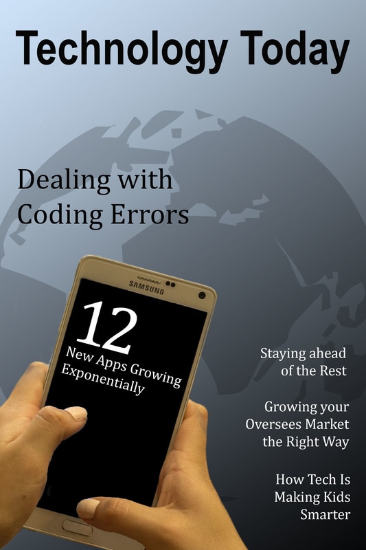
Exhibit 5 - Magazine Layout
|
Design Thoughts: I wanted to keep things simple. I left Negative space at the top for the eye to rest.
|
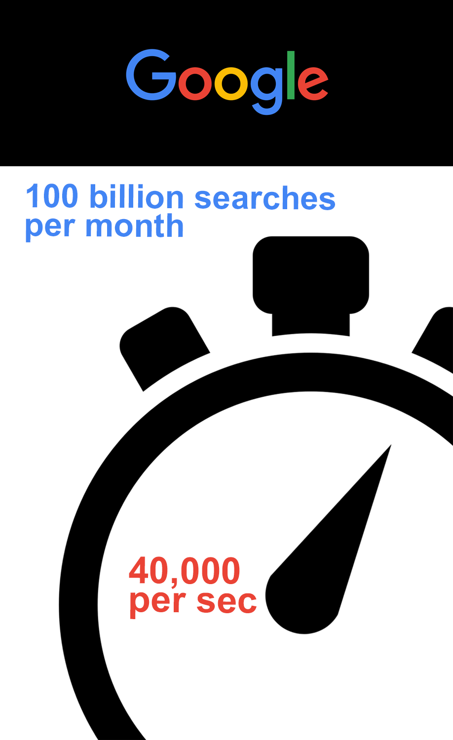
Exhibit 6 - Infographic
|
Design Thoughts:
I wanted to show how big Google really is.
|
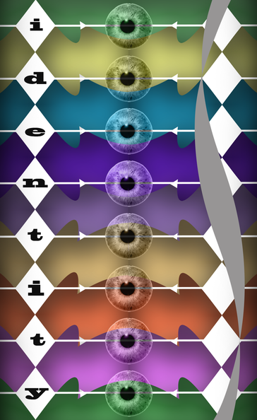
Exhibit 7 - Shape
|
Design Thoughts:
This was an exercise to show how shapes can become interesting and show meaning. There is some abstract meaning behind the design that can be interpreted by the viewer. Overall our identiy affects how we see things and although we can't see exactly how others view us, their perception can affect the way we see things as well. It becomes a mixture of differing perspectives.
|
Exhibit 8
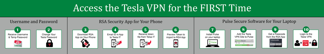
Design Thoughts:
This is an infographic designed to give an overview of the steps you will take over a 2 day period to get access to a company VPN. The design is based on the principles of grouping, segmenting, and sequence. More detailed instructions come later on but this gives the learner an overall understanding of what they need to accomplish. It's divided into three main segments and goes in chronilogical order. Icons are used to keep the information clear.
This is an infographic designed to give an overview of the steps you will take over a 2 day period to get access to a company VPN. The design is based on the principles of grouping, segmenting, and sequence. More detailed instructions come later on but this gives the learner an overall understanding of what they need to accomplish. It's divided into three main segments and goes in chronilogical order. Icons are used to keep the information clear.
- Contrast - The Green and white contrast as well as the circles and rectangles.
- Movement - The chronilogical numbers depict order and sequence. Learner will automatically read from left to right as a habit.
- Proximity/Alignment - You can see that the step were grouped together and separated by vertical lines to create segments. Subtitles also clarify this in the graphic.
- Grouping
- Type Tool
- Layers & Masking
- Text Tool
- Allignment
- https://thenounproject.com/term/laptop/585910/
- http://iconshow.me/locked-icon
- https://www.cataloguniversity.com/winning-email-headlines/
- http://www.flaticon.com/free-icon/cell-phone_191
- http://www.free-icons-download.net/mobile-email-send-icon-92600/
- http://www.zrarts.com/Apple-Cell-Phone-Images-Free-Downloads/
- https://itunes.apple.com/us/app/rsa-securid-software-token/id318038618?mt=8
- https://freeiconshop.com/icon/read-mail-icon-outline/
- https://icons8.com/web-app/category/Arrows
Exhibit 9
|
Before:
|
Afters:
|
|
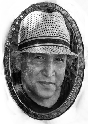
Design Thoughts:
This is one of my favorite pictures of my husband so I thought it would be fun to change it up a little. In the first change I brought it into camera raw and was able to take the red tint out of his face. In the second change I moved the picture to black and white and created some additional contrast by increasing the highlights and increasing the shadows. I also lightened up his eyes so they would pop more. In my third rendition I created a vintage photograph feel.
This is one of my favorite pictures of my husband so I thought it would be fun to change it up a little. In the first change I brought it into camera raw and was able to take the red tint out of his face. In the second change I moved the picture to black and white and created some additional contrast by increasing the highlights and increasing the shadows. I also lightened up his eyes so they would pop more. In my third rendition I created a vintage photograph feel.
- Contrast - My favorite is the black and white, it really pops.
- Proximity/Alignment - Rule of thirds.
- Cameraw Raw
- Layers & Masking
- Allignment
- Adjustment Layers
- Transform
- Blending Modes
- Clone Tool / Healing Brush
- http://maxpixel.freegreatpicture.com/static/photo/1x/Baguette-Frame-Filigreed-Carved-Ornament-Gold-1712562.png
- https://inspirationhut.net/design-resources/14-free-vintage-film-textures/
Exhibit 10: Video in Photoshop
Design Thoughts:
This is a video intro to a training created for our team. It gives a quick overview of what the training is about so that the learner can be prepared for the longer tutorials that come next. The music should catch the learners attention. The dark and light colors contrast to make it pleasing to the eye. The rule of thirds was applied for the first frames.
Photoshop Skills:
- Layers & Masking
- Allignment
- Adjustment Layers
- Transform
- Video Editing
- Company Assets
