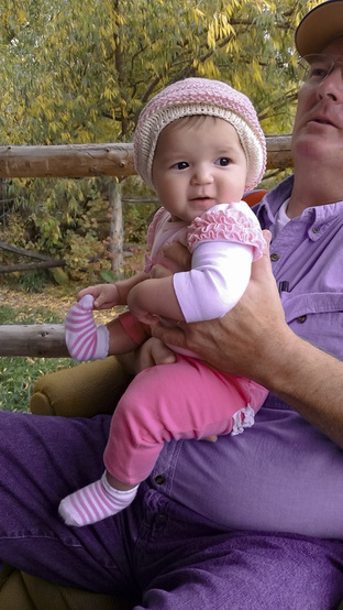
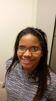
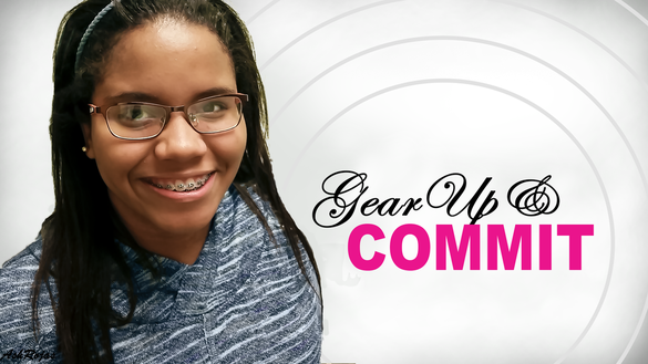
Exhibit 1 - Power of Camera Raw
|
BEFORE:
|
AFTER:
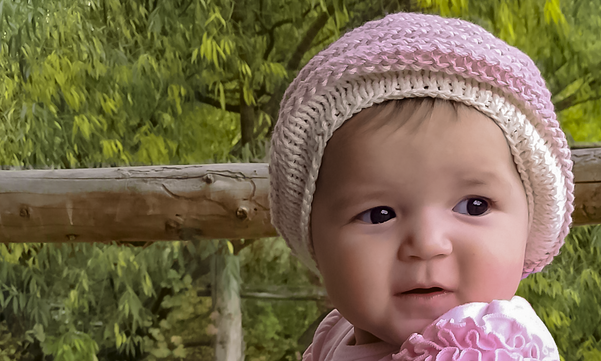
This image is to demonstarte the power of Camera Raw. It was first cropped using the rule of thirds to bring focus to the eyes. The temperature, contrast, clarity, saturation and vibrance were slightly increased. For coloring I increased yellows and aquas and decreased the blues to create more contrast. Luminance, color detail and color smoothness have also been increased.
The thought was to show Hannah's bright personality |
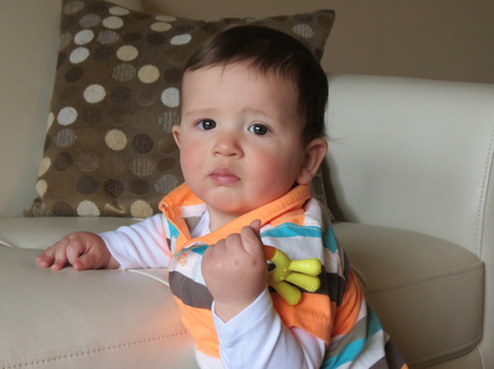
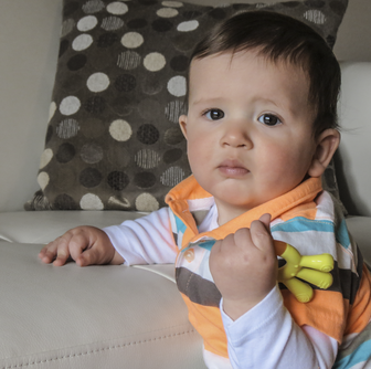
Exhibit 2 - Masking in Photoshop
|
BEFORE:
|
AFTER:
|
This picture has always been one of my favorites but i wanted to take away focus from the background. This was done using a black and white adjustment layer and a mask to bring Nathan out. I lowered the opacity of the overall adjustment layer so that the background doesn't look black and white but the focus goes where I want it to go. The image was cropped to guide the eye to Nathan's eyes.
Exhibit 3 - USU Stars Digital Display
|
BEFORE:
|
AFTER:
|
This after shot was created for a USU Stars Digital Display to motivate 7-8th graders. I chose a picture of my niece because I wanted those viewing it to feel a connection that the girl is just like one of them. The picture was cropped and edited in Camera Raw. I increased Clarity and Vibrance and decreased the Saturation. Next I increased the darks luminance and detail. The font used for the words Gear Up is Edwardian Script ITC whereas the font for the word Commit is Arial Black. I chose different colors and fonts to create Contrast. A mask was used to bring out the blue in her shirt so that it would contrast more with the word commit. The alignment of her eyes and the word Commit fall in line with the rule of thirds. I kept some the negative space but did add some circles to draw the eye in. A brush set to a low flow and less opacity was used to shade the sides which also creates and interesting look with the circles.
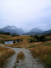
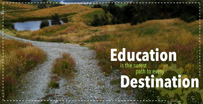
Exhibit 4 - Content Aware
|
BEFORE:
|
AFTER:
|
This was created as a digital display. The picture was taken in Paradise, New Zealand.
- Contrast: The white and bright green contrast well with the background so they pop. The eye is meant ot go to the words Education and Destination. The chosen font (Avenir Next Condensed has smooth and clean lines which contrast with the uneven textured lines of the path.
- Repetition: Education rymes with Destination. The same font is used for all words to create a concord feel. The dashed line repeats around the entire border drawing attention back to where I want it. If you follow the shape of the path you will see that the words have been aligned that was as well.
- Alignment: The words are placed close together do see they fit with each other and aligned to the rule of thirds.
- Proximity. I put the light gears in the background close to the words so that the viewer can associate education with Gear Up. the words are also placed at the beginning of the path suggesting Education is where you start.
- Typography: Concord
- Photoshop skills: Camera Raw, Crop Tool, Content Aware, Healing Tools
Exhibit 5- Information Flyer
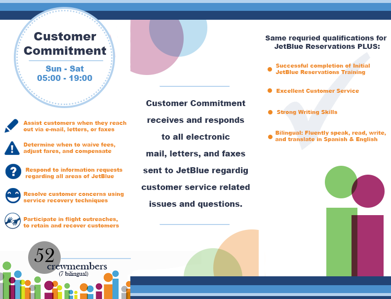
Tri-fold Information flyer made for an internal job fair at JetBlue. JetBlue colors and icons.
- Contrast: White background to bright colors
- Repetition: Lines and circles throughout
- Alignment: The words are placed close together do see they fit with each other and aligned to the rule of thirds.
- Proximity. Words are positions ed to icons to show they belong. Circles overlap to show teammwork
- Typography: Arial Black
- Photoshop skills: Shape Tool, Text, Grid lines
Exhibit 6 - Business Card
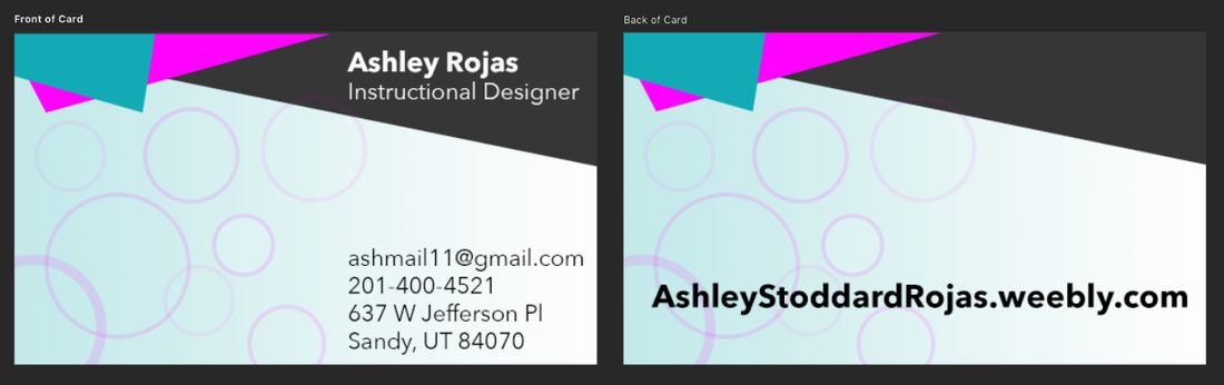
Personal Business Card.
- Contrast: White against black & black against white. The fractals contracts with the circles as well.
- Repetition: The circles repeat as well as straight lines in the fractals.
- Alignment: The words are placed close together do see they fit with each other and aligned to the rule of thirds.
- Proximity. Words are grouped together.
- Typography: Avenir Next (bold and regular)
- Photoshop skills: Vector Shapes, Type Tool, Gradient
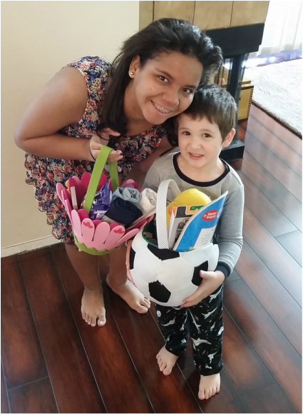
Exhibit 7 - Retouch Photo (Healing Tool)
|
BEFORE:
|
AFTER:
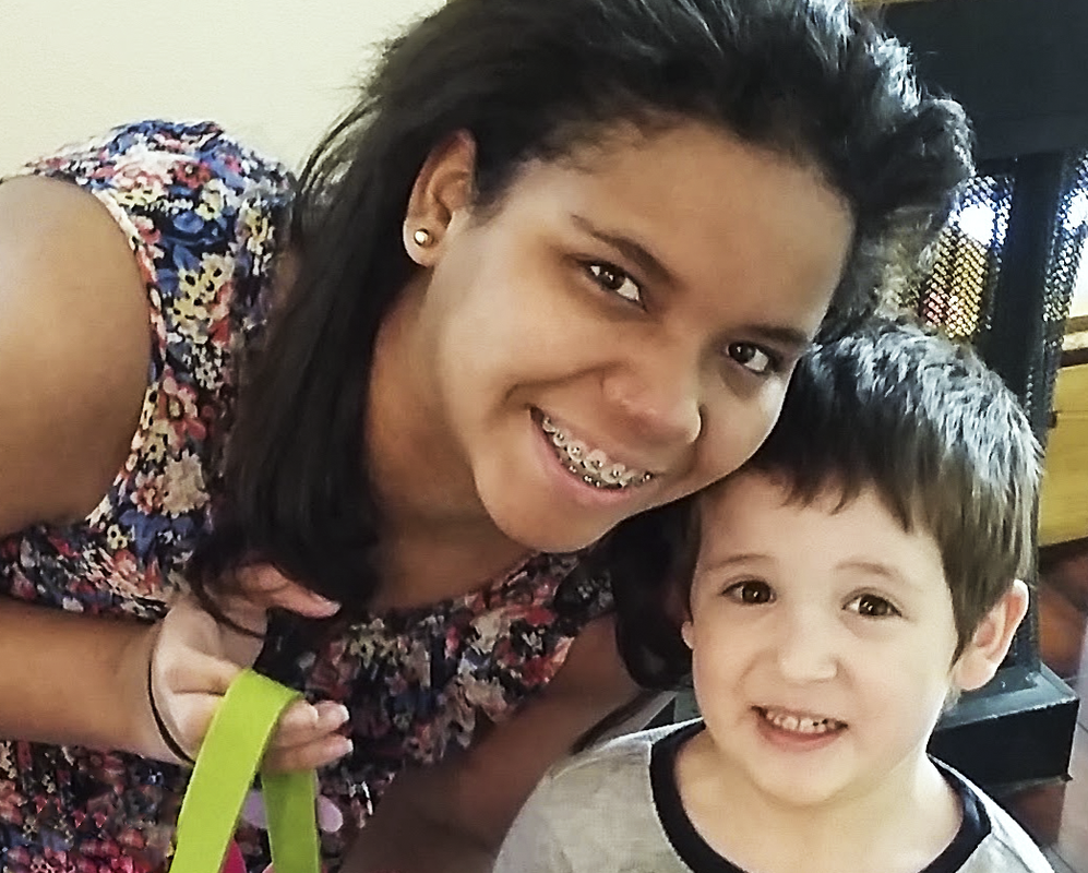
This was a picture taken Easter morning.
|
Exhibit 8 - New Zealand Panoramas
The following Panoramas were created from pictures that I took in New Zealand. The combining of the photos was done through Photoshop.
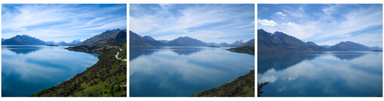
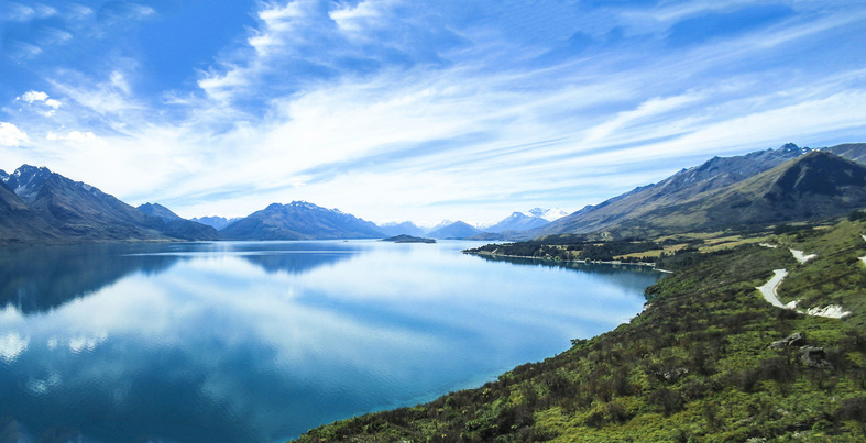
Photoshop Skills
- Adjusted Exposure, Hue, Clarity, Tint and Vibrance in Camera Raw
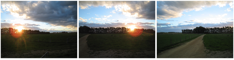
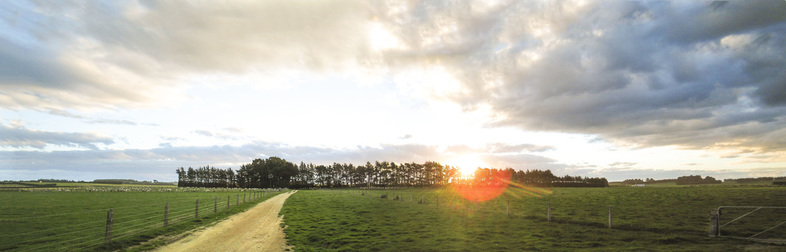
Photoshop Skills
- Adjusted Exposure, Hue, Clarity, Tint and Vibrance in Camera Raw
- Exposure Layer Mask in Photoshop
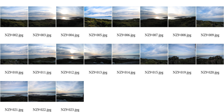
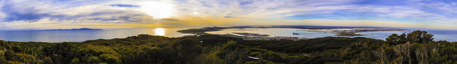
Photoshop Skills
- Adjusted Exposure, Hue, Clarity and Vibrance in Camera Raw
- Vibrance Adjustment Layer in Photoshop
Exhibit 9 - USU Digital Display

Digital Display shown on monitors to quickly remind students of a due date.
- Contrast: The deadline date in the top right hand corner becomes a main focus due it's contrast.
- Repetition: The clock is round and comes from the side as well as the round due date.
- Alignment: The words feel like they are curving with the flow of time.
- Proximity. The words are strategically grouped together in the bunches that should be read as one.
- Typography: Cambria regular font goes well with the serif numbers on the clock.
- Photoshop skills: Linear light blending mode with a gradient mask to bring the elements together.
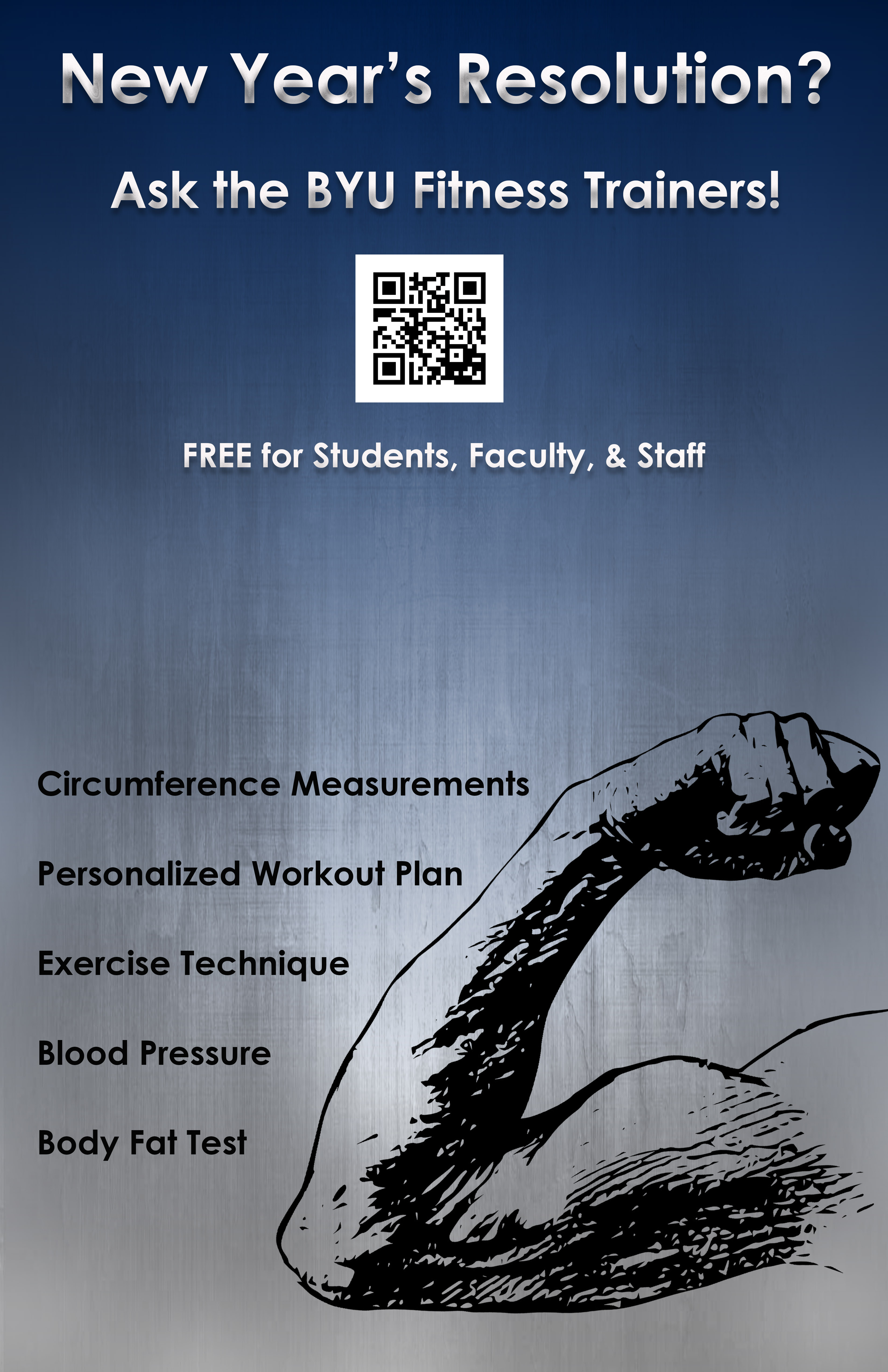
Exhibit 10 - Styles
|
This poster was designed for the BYU Fitness Center. I wanted to have a metal feel that goes with weights.
Photoshop Skills:
|
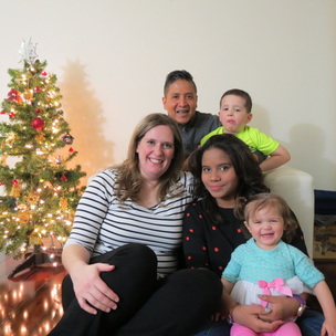
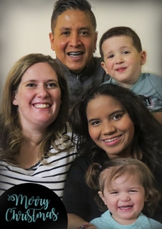
Exhibit 11 - Christmas Card
BEFORE (2 PHOTOS):
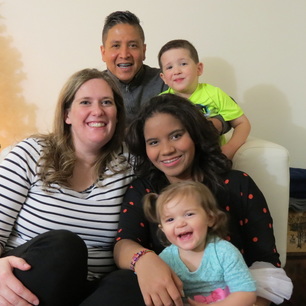
|
|
AFTER:
|

|
Photoshop Skills:
To make this Christmas card I had to combine two photos. To make the picture more cohesive I removed the red dots off of a shirt. Nathan was wearing neon yellow so I had to change the color of his shirt as well as remove the glow on his face. Marlon and Nathan's heads hat to be enlarged so that they didn't look so far removed. |
